February 29, 2012

Which should come first? The decor or paint?

I recently had a client who wanted her bedroom the “color of peacock”. Now as you well know, we are not talking about just one color but a combination of several hues.


These are some beautiful colors and would be very striking in the master bedroom but the question is, which comes first? The chicken or the egg - so to speak. How should you bring in color to your room, with your decor first or with the wall color?

You can do both. When I got to my clients house and viewed her bedroom, I saw that she already started a collection of “peacock” colors so right then and there I knew the wall color had to be quite.

She already had a pair of lamps for the night stands similar to this:


She had an original, very large painting that had all the “peacock” colors in it, similar to this:

Fine Arts America

And she already bought a few panels of navy blue velvet panels from IKEA: By the way, if you are looking for ready make panels, check out what IKEA has - they have extra long lenghts.


These are just three colors that could be considered Peacock colors but of course I could triple the palette and really nail the look but you get the general Peacock idea.


As a Color Specialist I have to envision what would be the best way to incorporate the look of Peacock into the room. Do I choose the bold colors and nail the look that way or keep the room neural and bring in colorful decor?

Well, either way would be fine. The only thing is if you choose these bright hues for the wall, they may get very overwhelming very quickly.

Since my client already purchased furnishing in the colors she loved, then it was up to me to incorporate ALL those colors plus put a little color on the wall that ties it all in. White was not an option - just can't do white walls!!!

This is what we came up with and she loved it!!! The main walls will be the first color. It's a great cross between green and blue and it's quiet - it has to be!


The very large tray ceiling will be the middle color. It's just a few shades darker than the wall color. It will bring the ceiling down a bit and really cozy up the room.

The third color is the bathroom. See the color of the lamp? She has the same color valance in the bathroom windows and her tile is the typical neutral beige/tan. The bathroom color also is a perfect match to her bedding so both the bedroom and bathroom are completely tied in.


Her namin Peacock colors are brought in by her decor and the wall colors are just subtle enough to tie it all it. I can't wait until this room is finished!!! Stunning color.


February 27, 2012

Pantone - Fall 2012 Color Report. Thumbs up?


Now these are very interesting colors for a fall palette. Before I started writing this post, I read Pantone Reveals their Fall 2012 Color Report in their Press Release and this is how the colors were described.

Leatrice Eiseman, executive director of the Pantone Color Institute® describes the colors as such:


 “From love potions and the magical hour of sunset to witches and warlocks, fantasy and illusion are inspiring designers this fall season. With an unexpected mix of darks, brights and neutrals, they cleverly manipulate reality to transport consumers to an enchanting place, free from the stresses of everyday life.”


They are really beautiful colors! However, I'd just like to talk about them a bit then figure out how we can get these hues out of the closet and incorporate them into beautiful wall color for our homes.

Looking at this palette, at first I'd thought “who would want to wear such colorful and summer-like colors in the fall?” Don't we gravitate more towards the warm spicy colors of autumn when we think of fall?


The colors I've designed here are very typical and traditionally seen in the fall palette. They are autumn leaves, pumpkin patches and Indian corn hues.

The colors that Pantone has selected are not the typical colors we see when we think about Falls colors. However, who says you have to wear certain colors during a specific time of the year? I would be very happy if I could wear my green apple hoodie year round. I love my coral shirt and purple is just good any season. 

So at first I jumped to conclusions and was going to protest that these were NOT fall colors. Hey, I'm from New York, I have a tendency to jump :-) but then I realized what I did with color.  I wear colors that make me feel good and colors that look good on me. 

Going back to how these hues were described, … free from the stresses of everyday life. And THAT my friends, is what color is all about.

So it doesn't matter if you like peach, pink, blue or green what matters is the you feel good when you wear or when you look at it.

Pinterest
Pinterest
Pinterest
Pinterest

This is another good reason to have a Color Specialist come to your home to help you choose color - the RIGHT color. Contact me to schedule a consultation so you can enjoy your favorite hues - year round!

Tickled Pink with Pantones Color of the Year

Home Furnishing Color Trends for 2012/2013 • From Runway to Home?

February 25, 2012

Is there a Color Expert for luxury homes in Charlotte?

Donna, 
I did a search for a Color Expert for Luxury Homes in Charlotte and I found your blog. Can you help me?  
I'm in the process of buying a large home in Waxhaw, in the Providence Downs area in Marvin. I was wondering if we can set up an appointment right after I close and help me choose color, you know, before I move in all my furniture. 
Is this something you can do? Please let me know, I should be closing around April. 
I look forward to hearing from you. 
Denise
Mint Hill


Denise,

With Spring Home Improvement right around the corner, you couldn't be moving in at a better time. It's the perfect time of year to paint and yes, I can help you with your color choices.

You're lucky to be painting your home before you move the furniture in. It'll certainly make things easy for you!

I do have a few bookings already in April so let me know what would work best for you - a weekend or weekday. I do have several clients in the Marvin area so I'm very familiar with the style home you have and how the lighting conditions will effect your color choices. For instance:

Here is a typical open living room with ample natural light. Let's say this light, smokey lavender is chosen for this room. See how beautifully it plays off the white trim and fireplace mantel?


But, keep in mind as the lighting conditions change outside, they will also change inside. So the light, smokey lavender that you chose in the daytime now looks like this in the evening.


It's knowledge like this that a true Color Specialist will know. With a home that is over 8,000 sq. ft. you certainly want to choose color RIGHT the first time. Contact me, Donna Frasca, a Color Specialist for South Charlotte when you have your closing date.

I look forward to seeing you and choosing color for your Marvin home!
Donna Frasca


February 23, 2012

Can you choose a door and shutter color for me?

Donna,
Two years ago you chose a beautiful coastal color palette for the inside of my home. Can you stop by and choose colors for my front door and shutters? I just put on a new roof and suddenly the rest of the home looks so old and dated.
 Look forward to hearing from you!
Kim,
Deerfield Creek Subdivision, Matthews, NC


Hi Kim! Of course I'd love to help you! You picked a great day in South Charlotte to start sprucing up your exterior. Spring Home Improvement is right around the corner!

Just to let everyone know, Kim has a two story, brick colonial. The colors I chose for her today pull in the dark hues from the brick (which is the door color) and the lighter grout color which will be for the for the shutters. This is one of the ways to really tie in the look of your home.

Here are the two colors I chose for Kim. The door color is Caponata and the shutter is Pashmina, Benjamin Moore colors. LOVE, LOVE, LOVE these!!!! I actually have a very similar color on my front door and the rest of my home gray so these are Color Expert approved :-)

Here are her colors. 

By the way, these are the gorgeous, very sought after coastal colors that I put in Kim's home in 2010.


Give me a call or email me if you live in South Charlotte.
I'd love to choose colors for you!


February 22, 2012

Q: I'm looking for some really different colors for my bedroom. Any suggestions?


Donna,
Since spring home improvement time is just around the corner, my husband and I would like to re-do our bedroom. 
We are looking for some colors that the both of us would like and colors that are not the typical blues and greens that are out now. 
I'm looking for some really different colors for my bedroom. Any suggestions? And thanks for having my question posted on your blog - love it!!! 
Karyn,
Waxhaw, NC


Karyn,

Thanks so much for loving my blog! You're my first Q&A post :-)

Ok, back to your bedroom colors. Yes - blue and green are very popular color choices for the bedroom for many reasons. They are colors that are both soothing and relaxing which are great attributes to have and they are just popular color choices in general. Ask your friends what their favorite color is and many will say either blue or green.

I understand you wanted something different for your bedroom. After a while it seems that everyone has the same colors in their home right? Ok, I have some great suggestions and actually used some of these already so I can tell you they look gorgeous!

If you like this look, try Magic Potion. It's one of my favorite colors to put in the Master and so many other colors will coordinate with it.  I see that you live in Waxhaw, if you need help coordinating this color into your bedroom, you can contact me to schedule a color consultation any day from 10and-1pm. 

ps - these are very sexy colors!
Good luck!

Donna Frasca
Color Specialist in South Charlotte

Benjamin Moore

February 21, 2012

Top 5 Colors To Paint Your Home This Spring

Wouldn't it be nice to take the guessing out of deciding what color to paint your home? Well here I have compiled a list of the top 5 colors that would and should be a consideration for your home.

GRAY
Keep it light and warm. 
Try using Seattle Mist by Benjamin Moore.

BLUE
Keep it soft and on the gray side.

Neutral
Choose a beige that will go with just about everything.

Yellow/Gold
A very warm color that looks good with all decors.
GREEN
One of my favorite go to greens by Valspar

Now that you have some colors to consider, I've also compiled a list of painting tips to go with these colors. Click on this link for some great Spring Home Improvement tips.

I'm a Color Specialist in Charlotte and these are the colors that I use often in Waxhaw, Marvin, Wesley Chapel and Weddington. However, just because I give you a list of awesome color doesn't mean it will look good in your home. You'll want to consider your decor and lighting otherwise these colors will look like a duck out of water - so to speak.  Email me at DonnaFrasca@mac.com to schedule an appointment to see how these colors will look in your home!

February 20, 2012

10 Home Improvement Painting Tips For Spring


Spring Home Improvement - it's right around the corner! 

Before you know it, spring will be right around the corner and you know what that means - spring home improvement projects. The flowers will be popping, birds will be chirping and you'll have the ambition to start those home improvement projects that you've been adding to your list all winter.

What are some of the spring home improvement projects? There are tons! Some of the most popular projects range from replacing your roof, staining your deck, organizing your closets, lawn and garden care to painting the interior of your home.  

Today, you guessed it, I'll be giving you 10 home improvement tips for painting your home. In my book, painting is the #1 spring home improvement, all the others can  wait.


So here we go! My top 10 spring home improvement tips for painting the interior of your home.

1. Plan
Stop! 
Before you start ANY projects - have a plan!


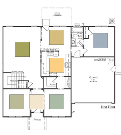
I know this is an obvious step but even before you start your projects, make sure you have a plan. Choose all your colors, lay them out and see if they look good together. The last thing you want is your home looking like a patchwork quilt where every room is a different color and makes no sense at all. This step is crucial if you live in any home that has an open floor plan. It's imperative that the colors flow from room to room.


Open floor plan

2. Color
When you are choosing the color for your home, make sure you are in the room that your are choosing the color for. Lighting is so crucial when it comes to choosing color, I can't even tell you! Make sure you are holding your paint chip vertically, not horizontally.


3. Paint
We all know that we have choices of “Good” “Better” and “Best”. Keep that in mind when choosing your paint brand. Different levels of quality WILL show in the results. Renting a home? Use an affordable brand at an affordable price. Have a very large home with 15' ceilings? Use the BEST paint you can because you will not want to be painting after a few years. High quality paints will not fade and some offer warranties. Read your labels, know your products.


Painting a bath room? Look in to paint that is specially designed bathrooms. It's specially formulated for these rooms and very worth it! They keep the mildew down in the high humidity areas and make clean up much easier. Highly recommend this step.


The same goes for the tools you use. Use the best you can afford and the right brush for the type of paint you are using. I highly recommend purchasing a Wooster 2" angled brush for cutting in.


4. Prime
Many of the new homes have Contractors Beige which is a neutral color but is very porous and rough. If you are painting your home for the first time, you'll either have Contractors Beige on your walls or just drywall. 

Priming the wall is a must. Many people don't prime before they paint so they are basically using their expensive paint, which can be up to $60 a gallon, as a primer. Primers prime. They have a purpose. Read the label and find out what primers do. It's better to prime the wall at $17 a gallon then to use your paint as a primer. And, I'm not a believer of those paint and primers in one. It's just a really thick paint with extra properties in it for better coverage but save money! Use a primer first then paint. The choice is yours.


or tintable primer if you are working with dark colors. 
Highly recommend this step to!


5. Decor
When you choose color for your home, you MUST take into consideration all the decor in your home. Make sure your undertones are the same so take a look at your kitchen cabinets, flooring and furniture to make sure your new color coordinates with them.


6. Inspiration
Stuck for color choices? A super easy way to choose color of a room is to pull a color from the artwork or bedding that is already in the room. 


Not very inspired? Than look in your closet. What colors do YOU really love? Your wardrobe may have all the answers!


7. Sheen
From flat to semi gloss, paint sheen has a vital role to play. Matte will not show wall imperfections but is not a good choice for high traffic areas like the hallways or kitchens - however - they do have washable mattes that are a life saver. 

One of the areas in the kitchen that I like to use at least a satin, is the area under the countertop. If you have seating there, you know how dirty this area can get. Use a satin here and it'll be a breeze to keep clean. I also like to use a dark or accent color here.


8. Placement
You can't or should I say, shouldn't, just put color anywhere. A dark color will look great on an accent wall but it may look great on the ceiling to. Map out where you want your color and keep in mind lighting. Have fun and be innovative with your choices.


9. Sample!!!!!
If you're on the fence about a color choice, sample it! Benjamin Moore has some large color samples, I believe they are 16"x16" and just a few dollars a piece. Here's a picture of me holding one - and look at all the color choices you have (background). The worst thing you can do is paint an entire room than decide you don't like the color.

Please don't do this!!

Sample color the RIGHT way.


or Small Wall paint boards.


10. Call a Professional
If you need help with ANY of these spring home improvement steps, don't hesitate to ask a pro. Lowe's or Home Depot specialize in these projects and have tons of ideas and information to help you. You can also check their website.

If you need help with just color, then contact me to schedule a Color Consultation if you live in South Charlotte. It's going to be a great spring! Let's start it right.

February 18, 2012

What Color Should I Paint My Ceiling?

Seattle Mist by Benjamin Moore


You would think it would be an easy answer - white. Not necessarily. Like any other wall in your home, the ceiling, aka the 5th wall, should also be a consideration. Choosing the right or wrong color here can really have a huge impact on the look in your home. Here's what I mean.

Look at the ceiling in this room. It's huge! If you make it white, you're going to walk into a very bright room. Since there are a lot of windows here, the white ceiling and light from the windows will be amplified. 

Ceiling Paint

Another problem in this room is the carpeting. Although it does have white in it, it very busy and should be the focus of the room. Everything else in this room needs to be quite. The walls are a neutral which is fine but I would certainly tone down the ceiling in this case. What color would I make it? That would of course depend on several factors but I think a warm gray would be perfect.

Seattle Mist is a light to medium tone hue that will make the ceiling appear a bit smaller and not so noticeable. It's both gray and beige so it ties in the wall and floor color. If we kept the ceiling white, the carpet would still stand out very much and I feel it needs to be toned down a bit or at least not be the first thing you see when you walk in the room.

Of course you'll notice the carpeting first but with the ceiling this color, it'll bring your eye up and will really tie in the look of this room. Add a charcoal gray leather sofa, brushed nickel accents and a neutral drapery to tie in the look.

If you need help with a ceiling color, contact me, I'd love to help you. Choosing the right ceiling color is pretty important and it's not the easiest area to paint so you just want to do it once - make it the right color.

Donna Frasca, Color Specialist in Charlotte, specializing in choosing JUST color for the homes in South Charlotte, Waxhaw, Weddington, Marvin and Wesley Chapel

February 16, 2012

Hire The Best Painter You Can Afford

Color consultations don't end when I leave my clients home, well, officially they do but the next step is to get the new color palette on your walls. Who will do that for you? This is where I get very nervous because hiring an inexperienced painter can and will make or break your color.


Here's what happens. A client hires me to come to their home to choose a brand new color palette - from basement to attic so to speak. We chat about the look you want, see what kind of lighting you have in your home, consider decor, home style, decide on a paint company then we begin choosing colors - together, in your home. I don't leave then go to my office and choose color, I work with you to make sure that every single color I suggest is to your liking. I also take it one step further and tell you why the color I just chose for your room is the right choice. There's really a lot of considerations other than just saying “oh that's a fun color, let's use it.


Anyway, my point is that there is a tremendous amount of thought, consideration and time that goes into a color consultation. I also take photographs of each room so the painter will have a reference to where the colors are going. Layout can get a bit tricky if you have a home with an open floor plan. So in about a week after the consultation, you'll receive a color portfolio with your new color palette, paint brand we decided on, any additional notes like paint sheen, ceiling color, repairs or any additional interior design services that you may need.


Now it's time to hire a painter. You've just hired a Color Expert and you have your color palette.  You know you'll be spending a few thousand dollars on painting. I'm sure you've heard the saying “you get what you pay for” well this is where it really applies.

Painting quotes can range from a few hundred dollars to several thousand dollars. I know everyone has a budget but make sure the painter you're hiring will do the job right. Here's some of the concerns you should keep an eye out for.

Beautiful color is completed when you have experienced painters.


Are they linseed and insured?

What paint brand are they using? You THINK they are using Brand A but how can you be sure? That's what is says on the label but what's  really inside the can?

Is the paint watered down?

Are they using primer?

Are you paying for brand A but getting a cheaper paint brand?

Are they neat?

Will they clean up well when complete? 

Does your painter have references?

Are they part of the BBB?

Is you painter going to color match?

These are just a few questions and concerns to be aware of. There are really so many more. What does this all mean? Just use your best judgement. The main thing is, and this is my concern, is you can have the best color scheme in the world but if it's not painted well, your color will just not look right.

So if you live in Charlotte, NC and would like a color consultation I'd be more than happy to help you  BUT if you choose to use your own painter and they do a shabby job, it will change the entire look of your home - and it' won't be good. Invest in the best! From color to paint and to the best painter you can afford. Let me know if I can help!